Supreme font
The Supreme box logo is based on Futura Heavy Oblique, tightened and slightly extended inside the famous red box.
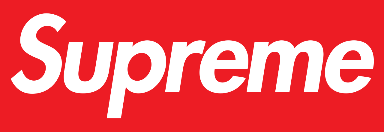
A Supreme font generator, your words in this lettering, as an image you can keep.
What it matched
About the lettering
James Jebbia launched Supreme in 1994 with a logo lifted from Barbara Kruger's propaganda-poster artwork: white Futura italic type in a red box. Kruger herself worked in Futura Bold Oblique, and Supreme's version adjusts the cut slightly, bolder and tighter, but the debt is openly acknowledged in design histories of the brand.
Common questions
What font is used in the Supreme logo?
Supreme's box logo is based on Futura Heavy Oblique, Paul Renner's geometric sans, set tight and slightly extended inside the red box.
Is the Supreme logo copied from Barbara Kruger?
Yes, in style: founder James Jebbia modeled the white-Futura-in-a-red-box format on Barbara Kruger's propaganda-style artworks, which used Futura Bold Oblique.
What is a font similar to the Supreme logo?
Any heavy oblique cut of Futura comes closest; the logo itself is a customized setting of Futura Heavy Oblique rather than a separate font.
Make your own in this style
Your words in the Supreme lettering, pick a treatment, download the image, keep it. The full catalog lives in the generator.