NASA font
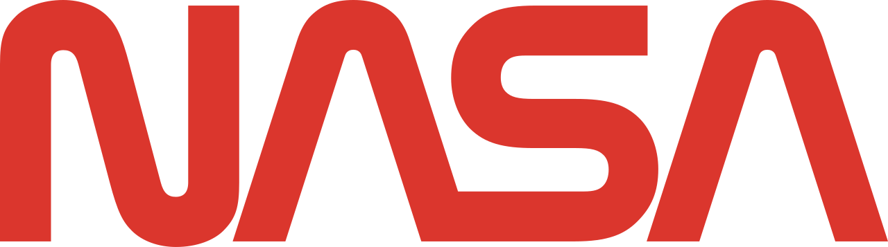
The NASA 'worm' is custom logotype lettering, not a font; Nasalization is the closest documented lookalike.
A NASA font generator, your words in this lettering, as an image you can keep.
What it matched
About the lettering
The worm was designed by Richard Danne and Bruce Blackburn and adopted in 1975 as part of a federal graphics modernization program. Its A's are drawn without crossbars, their peaked shape suggesting a rocket nose cone. NASA retired the worm in 1992 in favor of the older 'meatball' insignia, then reinstated it in 2020 as a secondary mark.
Common questions
What font is used in the NASA worm logo?
The worm is custom lettering by Danne & Blackburn (1975), not a font. Nasalization by Ray Larabie is the closest documented lookalike.
What is a free font similar to the NASA logo?
Nasalization (Typodermic Fonts, 2005) recreates the worm's rounded, crossbar-free letterforms and is free for commercial desktop use.
Why do the A's in the NASA worm have no crossbar?
The crossbar-less A was a deliberate stylization in the 1975 Danne & Blackburn design, its peaked form suggesting a rocket nose cone.
Make your own in this style
Your words in the NASA lettering, pick a treatment, download the image, keep it. The full catalog lives in the generator.