The Hunger Games font
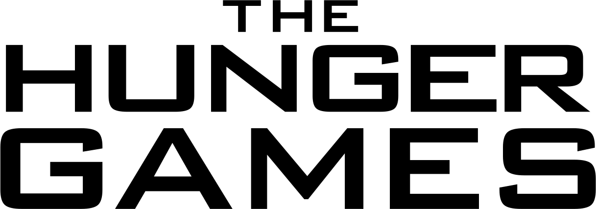
The Hunger Games posters are set in Bank Gothic, Morris Fuller Benton's 1930 square grotesque.
A The Hunger Games font generator, your words in this lettering, as an image you can keep.
What it matched
About the lettering
The posters set the title in Bank Gothic (the Medium weight) in wide tracked capitals, the standard look of the series' one-sheets and the films' title treatment. Wikipedia's Bank Gothic usage list, Postergrind and the DaFont identification forum all credit the same font independently of FontMeme.
Common questions
What font is used in The Hunger Games?
The posters use Bank Gothic, designed by Morris Fuller Benton in 1930; the Bitstream edition is the common one.
Is the Hunger Games font free?
Bank Gothic is commercial. Opti Bank Gothic is a free clone named as the alternative.
Who designed the Hunger Games font?
Morris Fuller Benton designed Bank Gothic for American Type Founders in 1930.
Make your own in this style
Your words in the The Hunger Games lettering, pick a treatment, download the image, keep it. The full catalog lives in the generator.